In this article, we will delve into creating flexible page layouts for Metalsmith by utilizing Markdown and Nunjucks templating. For the purpose of this discussion, we will refer to these pages as "Sectioned Pages."
Ordinarily, Markdown pages comprise two main parts: frontmatter and a page body. The frontmatter typically encapsulates metadata elements such as the template name, draft status, SEO title, and description, among others. On the other hand, the page body constitutes the core content, representing a sizable, unstructured Markdown block.
While this format works perfectly for simple blog posts and basic page layouts, it falls short when designing web pages with more intricate structures. This is where sectioned pages come in.
Sectioned pages are entirely composed of structured data within their frontmatter, written in the YAML format, and notably, they don't include a body. The YAML data serves as the page's content model, neatly segmenting the content into distinct components. Each component is defined by a specific set of fields, where a field denotes a YAML key:value pair. These fields can hold short text strings, numbers, booleans, and even Markdown, thanks to YAML's support for multi-line text areas. Each component subsequently utilizes a template that processes these fields.
This methodology empowers us to create reusable templates that can be utilized individually or in groups, anywhere within the site. With predefined layouts and styles, it facilitates a consistent content representation throughout the site.
Page source
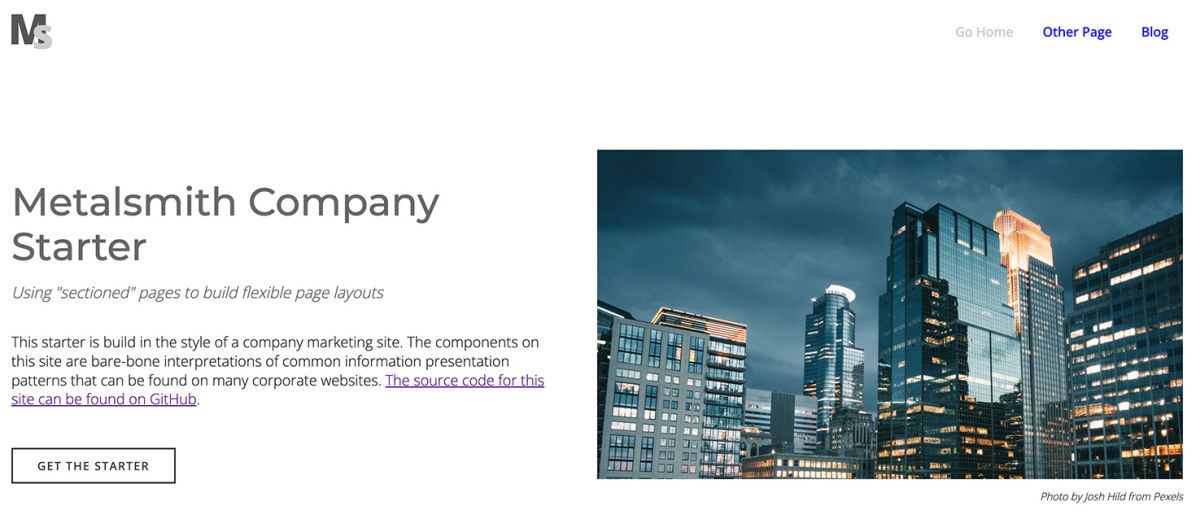
What does that look like in practice? Here is the code of the home page of the Metalsmith Company Starter.
index.md
---
layout: sections.njk
bodyClasses: "home"

seo:
  title: Metalsmith Company Starter
  description: "A starter to build a company website with Metalsmith"
  socialImage: "/assets/images/metalsmith-starter-social.png"
  canonicalOverwrite: ""

sections:
  - component: banner
    ...
  - component: intro
    ...
  - component: media
    ...
  - component: media
    ...
  - component: intro
    ...
---
The section of particular interest here is sections. This represents all the section entries for the page and is structured as a YAML list. It begins with a banner component, followed by intro and media components which form the rest of the page. The resulting rendered page appears as follows:
Let's have a look as the banner component in detail.
banner.njk
- component: banner
disabled: false
inContainer: true
marginTop: false
marginBottom: true
paddingTop: false
paddingBottom: true
backgroundColor: ""
targetId: ""
title: Metalsmith Company Starter
header: "h1"
subtitle: Using "sectioned" pages to build flexible page layouts
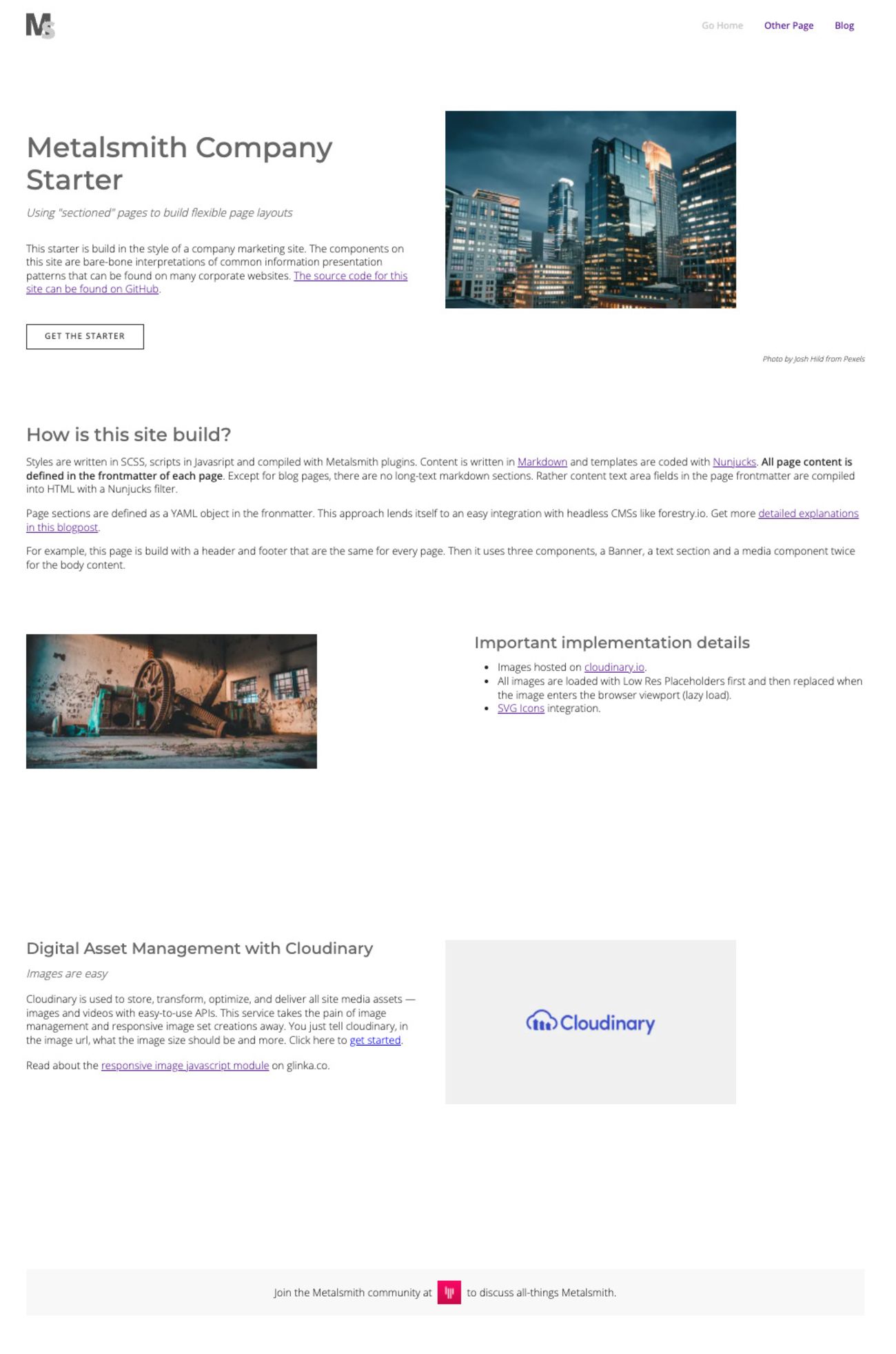
prose: This starter is build in the style of a company marketing site. The components on this site are bare-bone interpretations of common information presentation patterns that can be found on many corporate websites. [The source code for this site can be found on GitHub](https://github.com/wernerglinka/metalsmith-company-starter).
hasCtas: true
ctas:
- url: "https://github.com/wernerglinka/ms-components"
label: Get the Starter
isExternal: true
isButton: true
buttonStyle: "primary"
isVideoTrigger: false
videoId: ""
mediaType: Image
video:
src: youtube
id: ""
tn: ""
aspectRatio: ""
caption:
image:
src: "v1647546742/tgc2022/corporate_ip4qbt.jpg"
alt: "Metalsmith Javascript"
aspectRatio: "56.25"
caption: "Photo by Josh Hild from Pexels"
lottieData:
src: ""
control:
autoplay: true
loop: true
icon: ""
audio:
bgImage: ""
aspectRatio: ""
ogg: ""
mpeg: ""
caption:
We can easily see how the banner component content model correlates to the rendered page section.
disabled: false
A component can be deactivated, meaning it won't render, but its code can remain intact. This is typically used as a temporary measure. If the component becomes redundant, its code can simply be removed from the project.
inContainer: true
marginTop: false
marginBottom: true
paddingTop: false
paddingBottom: true
backgroundColor: ""
A component has the flexibility to either be enclosed within a container or extend across the full width of a page. By adjusting margins and padding, we can effectively manage the spacing between neighboring page sections. Moreover, it's possible to apply a background color to further enhance the visual layout of the page.
targetId: ""
A component may be the target for in-page anchor links.
title: Metalsmith Company Starter
header: "h1"
subtitle: Using "sectioned" pages to build flexible page layouts
prose: This starter is build in the style of a company marketing site. The components on this site are bare-bone interpretations of common information presentation patterns that can be found on many corporate websites. [The source code for this site can be found on GitHub](https://github.com/wernerglinka/metalsmith-company-starter).
In this case the section title is an h1 as it is also the page title.
hasCtas: true
ctas:
  - url: "https://github.com/wernerglinka/ms-components"
    label: Get the Starter
    isExternal: true
    isButton: true
    buttonStyle: "primary"
    isVideoTrigger: false
    videoId: ""
This particular component can feature multiple call-to-action (CTA) prompts, although in the current instance, it incorporates just one. The CTA could direct users to either an internal or external page, or it could trigger a video modal. Furthermore, it can be displayed in various formats such as a button or a simple text link.
mediaType: Image
  video:
    src: youtube
    id: ""
    tn: ""
    aspectRatio: ""
    caption:
  image:
    src: "v1647546742/tgc2022/corporate_ip4qbt.jpg"
    alt: "Metalsmith Javascript"
    aspectRatio: "56.25"
    caption: "Photo by Josh Hild from Pexels"
  lottieData:
    src: ""
    control:
      autoplay: true
      loop: true
  icon: ""
  audio:
    bgImage: ""
    aspectRatio: ""
    ogg: ""
    mpeg: ""
    caption:
The banner component encompasses a media element that can vary, including an image, a video, an icon, or even a Lottie animation. It's important to note that we specify the aspect ratio for images. This is required for the responsive image component implemented on this site.
Partial elements such as CTAs and media types are shared among various components. However, distinctive styles are applied to the banner via the Nunjucks template.
Templating System
The rendering of the page involves several templates. A default layout.njk template supplies the page container along with the header and footer. Meanwhile, the sections.njk template takes charge of rendering all the components.
layout.njk
<!DOCTYPE html>
<html>
  <head>
    {% include "sections/head.njk" %}
  </head>
</h1>

<body class="{{ bodyClasses }}">
  <div id="at-top"></div>
  {% include "sections/header.njk" %}

  <main>
    {% block body %}
      This is the default contents
    {% endblock %}
  </main>

  {% include "sections/footer.njk" %}
  {% include "partials/scripts.njk" %}

</body>
</html>
sections.njk
{% extends "layout.njk" %}

{% from "./sections/component.njk" import component %}

{% block body %}
  <section class="main-content">

    {% for section in sections %}

      {% set name = section.component %}
      {% set params = section %}
      {% set site = site %}

      <div class="section-wrapper {% if section.inContainer %}inContainer{% endif %}">
        {{ component(name, params, site) }}
      </div>

    {% else %}
      <p class="error-message">There are no sections available</p>
    {% endfor %}
  </section>
{% endblock %}
At the core of this methodology is the sections.njk template. Notably, all components are integrated into the template by a name reference. The template proceeds to loop through all sections, rendering them based on their position in the list. Consequently, a section's position is not hard-coded but rather contingent on its list placement. If you wish to reposition a section, it's as simple as relocating the component code in the page source. When using a CMS like forestry.io, this relocation can be accomplished effortlessly with a drag and drop feature.
To introduce a section, we employ a Nunjucks macro component. Utilizing a macro safeguards the component fields from global scope interference, preventing components with identical fields from overwriting each other's properties.
component.njk
{% macro component(name, params, site) %}
  {% include "../sections/" + name + ".njk" ignore missing %}
{% endmacro %}
The metalsmith-company-starter code is available at https://github.com/wernerglinka/metalsmith-company-starter and the demo site can be viewed at https://metalsmith-company-starter.netlify.app/
For another comprehensive example of this website building technique, you can visit the following link: https://ms-page-sections.netlify.app/. It provides an excellent showcase of how this methodology can be implemented in practical scenarios.