The Minneapolis project harnesses a modular approach to web page construction. This innovative paradigm sees web pages as a composition of distinct, purpose-specific sections. Each section contributes unique content or functionality, and when combined, they seamlessly assemble into a comprehensive web page.
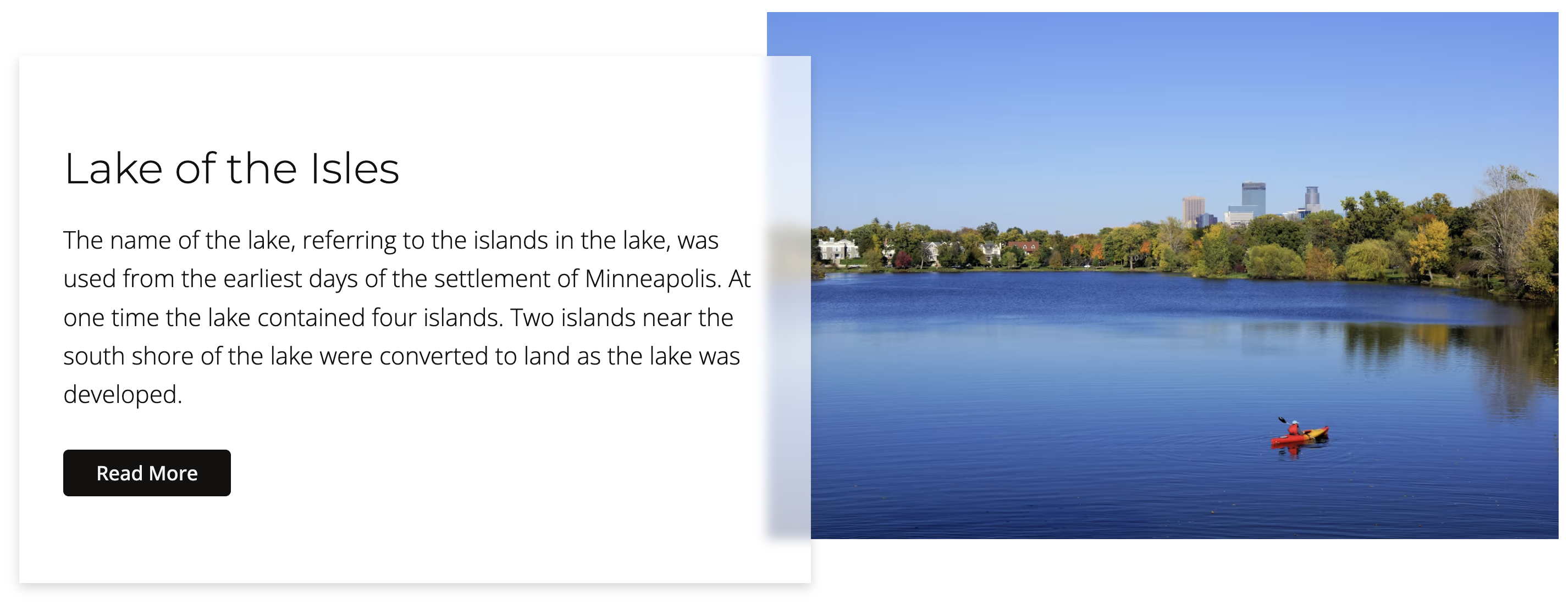
To illuminate this concept, let's delve into the Lake of the Isles section of the project website, available at https://dev-mpls.pantheonsite.io/. This section leverages a design element widely referred to as a "media object". Characterized by its two-column format, the media object combines compelling visuals on one side and relevant textual content on the other. This aesthetic design pattern has been adopted and embraced broadly across the web due to its ability to blend information delivery with visual interest.
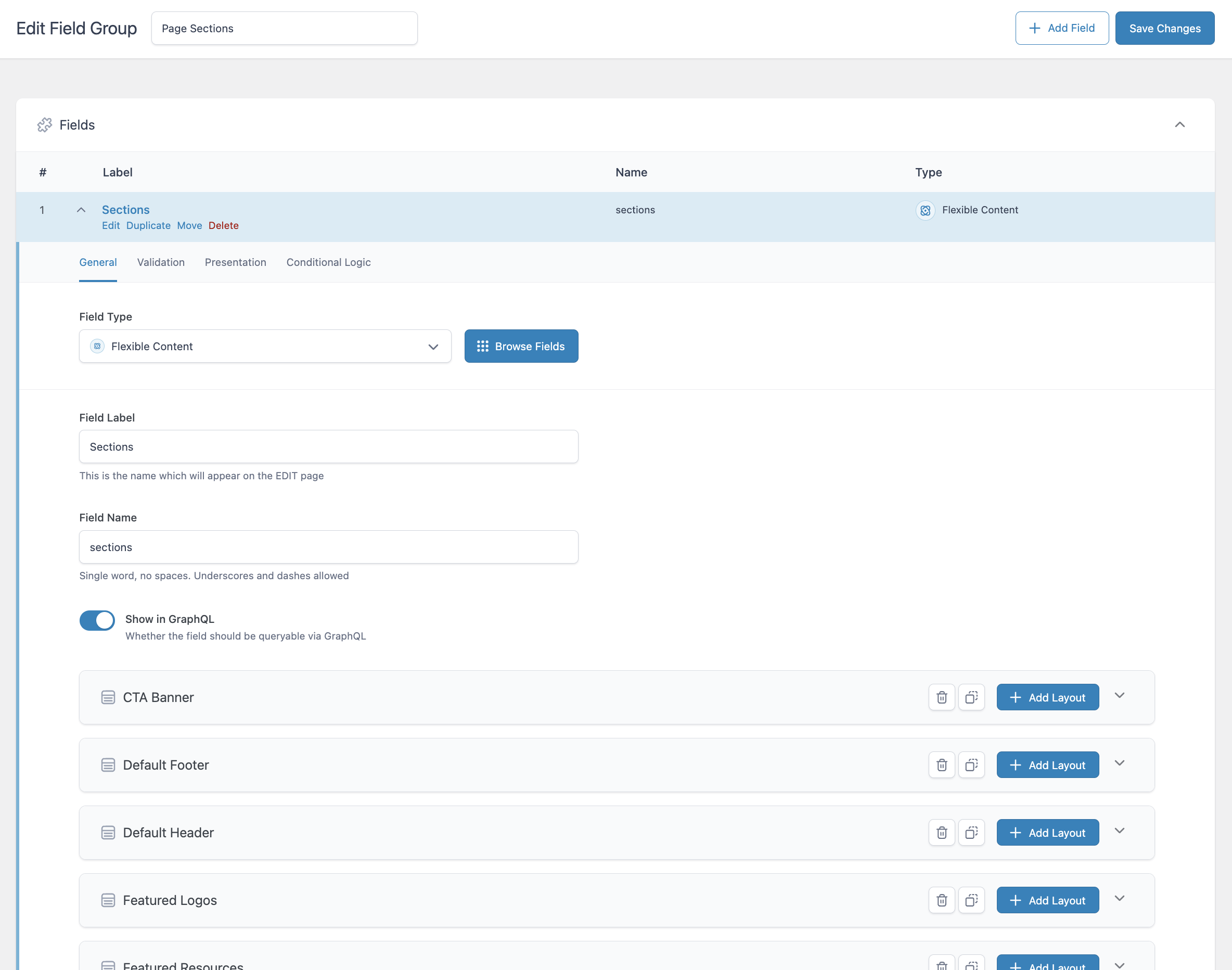
To formulate the schemas for our various page sections, including the media section we just analyzed, we'll employ a group in Advanced Custom Fields (ACF) named Page Sections. Within this group, we will utilize a single Flexible Content field labeled Sections. Here, we'll lay out the different configurations for our page sections, encompassing the media section as well.
For those embarking on this approach for the first time, I highly recommend reviewing the blog post titled DIY Page Builder with ACF. It offers a beginner-friendly guide to implementing this strategy effectively.
Sections
Media Section Definition
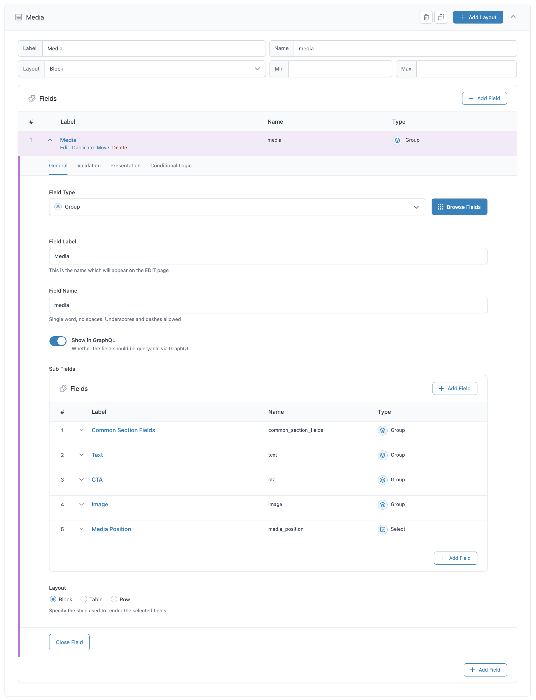
Here's a glimpse of what our media section layout looks like within the ACF User Interface (UI). It's characterized by a single group field labeled 'Media'. This group field encompasses all the necessary fields to effectively render the media section. What's more, these fields are themselves group fields that house a cloned field. By adopting this configuration, we're able to reuse cloned fields across a variety of section layouts, which not only streamlines the UI but also brings a logical structure to the content.
Building the page
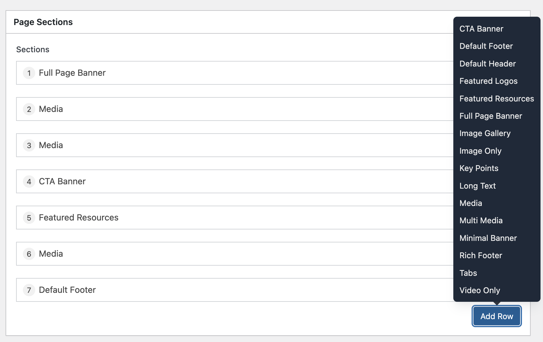
In order to construct a page, we employ the Sections field as our toolbox for adding different page sections. For instance, we can introduce the Media section to the page and fill it with appropriate content. All sections will be rendered in the sequence they were added to the page, but they can easily be repositioned by dragging and dropping to their preferred locations.
Media Section Content
And here are the media section fields with the content added.
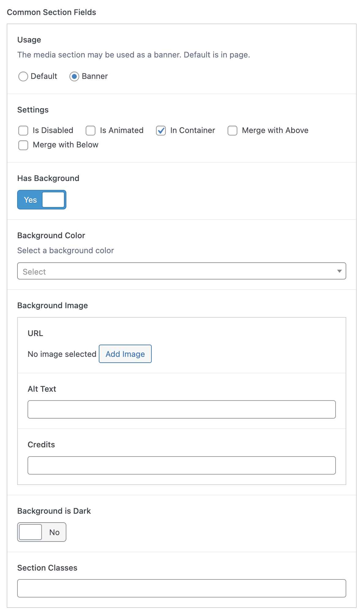
Common Section Fields
These fields are the foundation for all sections and provide essential information such as section type, background color, or other common attributes shared across different sections.
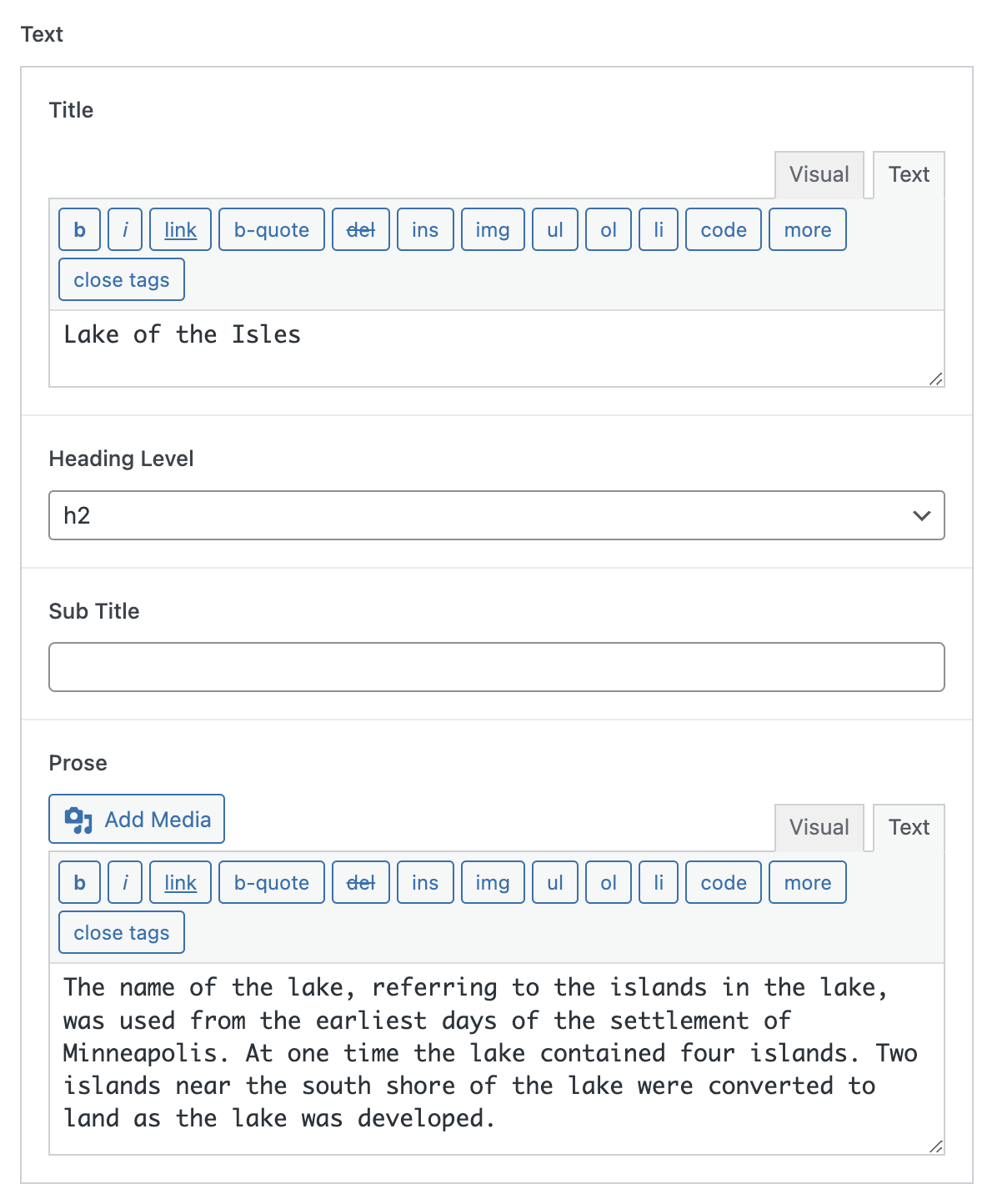
Text
This component allows for the inclusion of textual content within the media section. It provides flexibility to add optional title, subtitle and prose.
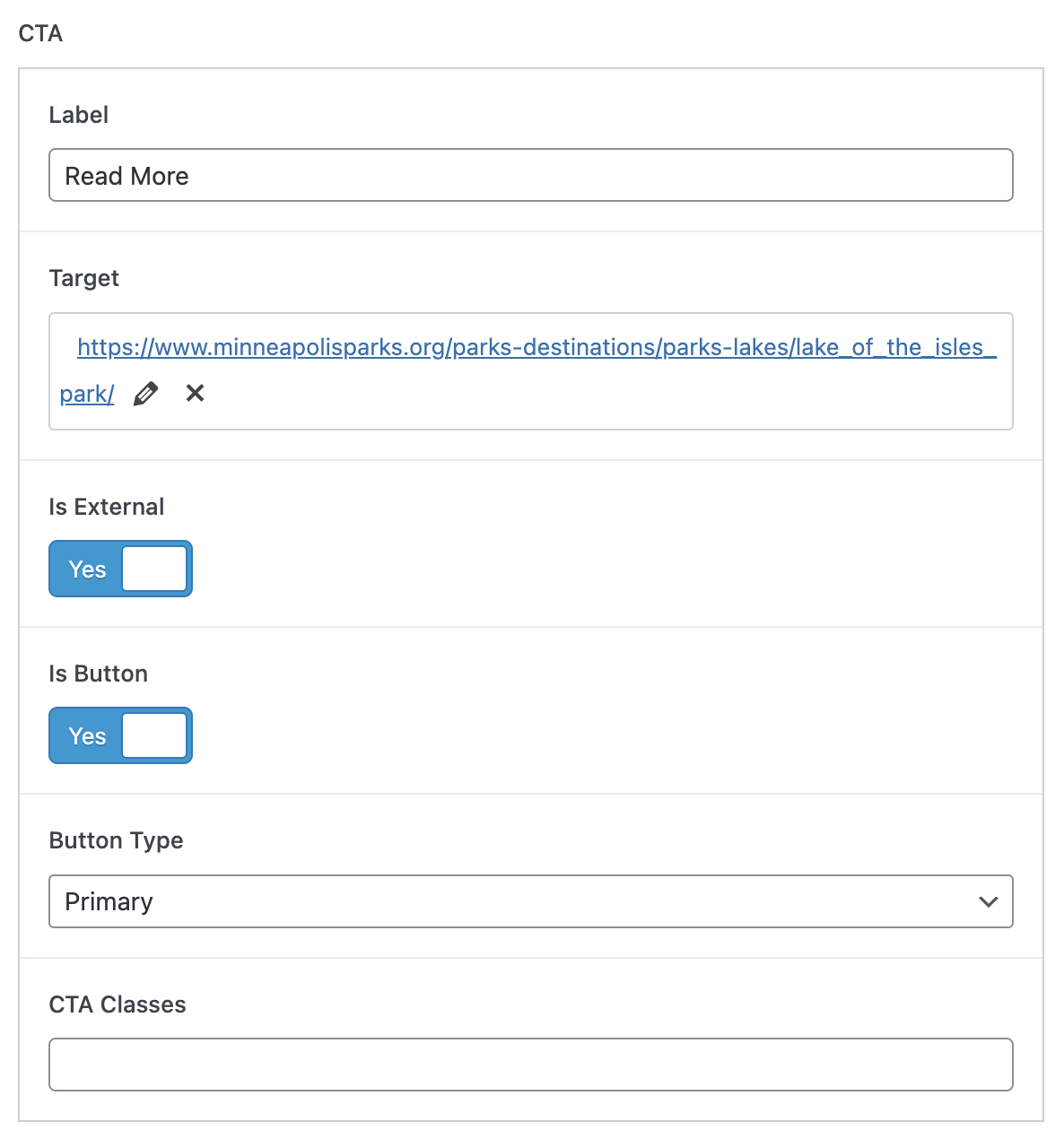
CTA (Call-to-Action)
The CTA element enables adding actionable content within the media section, such as buttons or links.
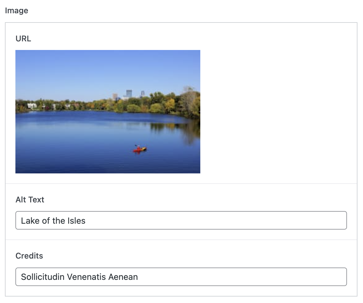
Image
The image component plays a pivotal role in the media section, allowing for the integration of visually appealing graphics or photographs.
Media Position
This setting provides the ability to control the positioning of the media object within the media section. It enables layout customization by specifying whether the image should be on the left or right side of the accompanying text.

Media Section Template
Now that we've defined the section, it's time to examine the section template. This template doesn't alter the actual front-end display of the website, instead, it's a tool for editors, providing them with a preview of the content and layout while they are busy constructing the page. We'll delve deeper into the front-end templates in an upcoming blog post.
Initially, let's look at the page template. This template renders all sections in the order they are defined on the editing page.
page-with-sections.php
  <?php
    /**
    * Template for a sectioned page
    *
    * Template Name: Sectioned Page
    * Template Post Type: page, post
    *
    * @package mpls
    */


    include_once(get_template_directory() . '/page_sections/inc/shared_functions.php');
    include_once(get_template_directory() . '/page_sections/inc/section_components.php');

    get_header();
  ?>

  <div id="primary" class="content-area">
    <main id="main" class="site-main">

    <?php
      // ID of the current item in the WordPress Loop
      $id = get_the_ID();

      // check if the flexible content field has rows of data
      if ( have_rows( 'sections', $id ) ) :

        // loop through the selected ACF layouts and display the matching section
        while ( have_rows( 'sections', $id ) ) : the_row();

          include(get_template_directory() . '/page_sections/inc/render_layout.php');

        endwhile;
      elseif ( get_the_content() ) :
        echo "No sections found.";
      endif;
    ?>

    </main><!-- #main -->
  </div><!-- #primary -->


  </div><!-- #content -->
</div><!-- #page .site-wrapper -->

<?php wp_footer(); ?>

</body>
</html>
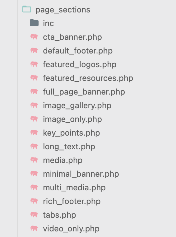
All section templates are in the folder page_sections and the template name matches the ACF field name. For each layout found, we invoke render_layout.php to render the section.
render_layout.php
<?php

  // get the layout name
  $thisLayout = get_row_layout();
  $props= get_sub_field($thisLayout);

  //check if this section is disabled. If disabled, bypass rendering the section
  $is_disabled = isset($props['common_section_fields']['settings']) && in_array("is_disabled", $props['common_section_fields']['settings']);
  if (!$is_disabled) {
    $background_image = $props['common_section_fields']['background_image'];

    // determine section usage, e.g. is this section used as a banner or a section
    // if usage is as a section, then the wrapper type may be a <section> or an <aside>
    // if usage is as a banner, then the wrapper type is a <section>, overwriting the value of $wrapper_element
    $wrapper_element = $props['common_section_fields']['wrapper_element'];
    $usage = $props['common_section_fields'] ? $props['common_section_fields']['usage'] : "banner";
    $wrapper_type = $usage == "banner" ? "section" : $wrapper_element;

    // build the body classes string
    $body_classes= build_section_class_string($props);
    // build the styles string
    $body_styles= build_section_styles_string($props);

    echo "<" . $wrapper_type . " class='page-section " .  str_replace('_', '-', $thisLayout) . " " . $body_classes . "' ";
    if($body_styles) {
      echo "style='" . $body_styles . "'";
    }
    echo ">";


    if ($background_image['url'] != "") {
      echo "<div class='background-image'>";
      render_image_component($background_image);
      echo "</div>";
    }

    get_template_part( 'page_sections/' . $thisLayout, null, array('props' => $props));

    echo "</" . $wrapper_type . ">";

  }
?>
In the render_layout.php file, the initial step checks if the section is disabled or not. Should it not be disabled, the rendering process will proceed.
Following this, the code proceeds to render common section items. These elements are key to providing consistency throughout all sections of the website. A noteworthy element is the wrapper for the section. The wrapper includes relevant classes and inline styles to define the section's appearance and behavior. Moreover, should a background image be specified for the section, this is where it's added to the wrapper element.
Finally, the section-specific template comes into play. For our media section, the dedicated template is media.php. This template is responsible for rendering components and layout characteristics unique to the media section - like the image, the text, the call to action (CTA), and the media position.
This rendering process is designed so that while each section retains its unique layout and functionality, they all still adhere to the common elements and styles defined in the wrapper and the common section items. It's a harmonious blend of uniformity and distinctiveness that makes the entire web page feel cohesive yet diverse.
media.php
<?php
/**
* Page section for displaying a page banner
*
* @package hlwp
*/

  $props = $args['props'];
  $text = $props['text'];
  $cta = $props['cta'];
  $image = $props['image'];

?>

<div class="container">
  <div class="columns">
    <div class="column text">
      <?php render_text_component($text); ?>
      <?php render_cta_component($cta); ?>
    </div>
    <?php if($image['url']) : ?>
      <div class="column media image">
        <?php render_image_component($image); ?>
      </div>
    <?php endif; ?>
  </div> <!-- .columns -->
</div><!-- .container -->
The end result is the media section above.
In the next blog post we will review how to build our page section queries which are used by Metalsmith to build the static site.